Navigating Projects with Burndown Charts: A Clear Path to Success
Whether launching a new item, creating software, or starting a marketing push, projects help businesses grow and innovate. However, there's a lot to juggle to make sure everything goes right, and this is where project management tools come in.
These tools help teams understand what they need to do, by when, and how things are progressing. They're like roadmaps for projects, helping teams tackle problems and stay on track, and a ‘burndown chart’ is a fantastic tool.
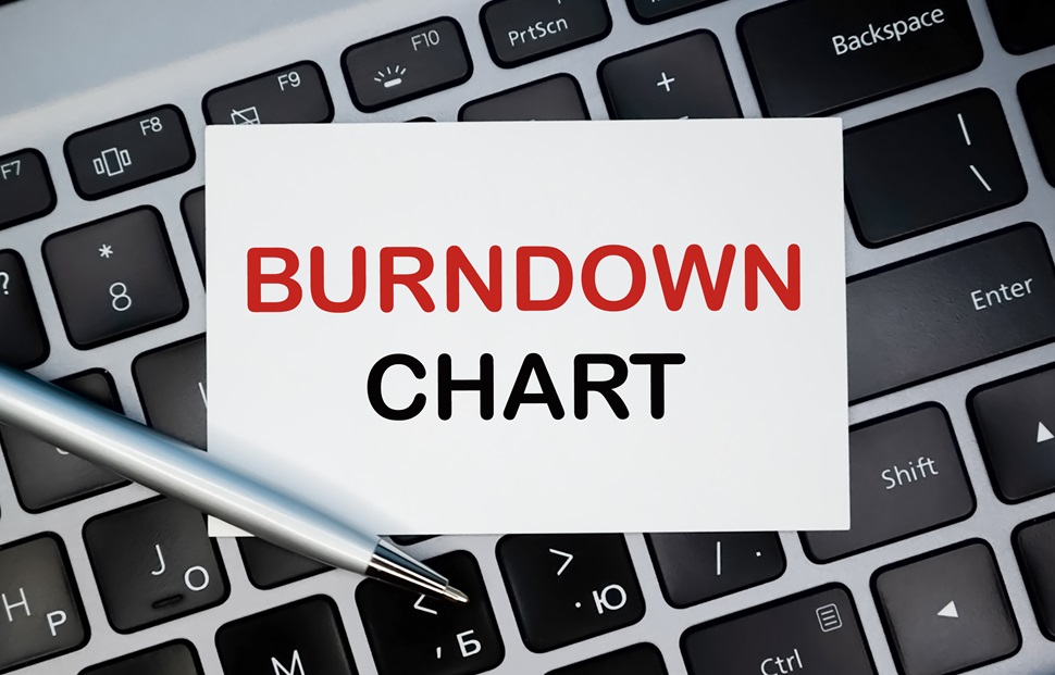
However, what exactly is a burndown chart? It's a simple way to show how much work is done and how much is left. It's especially popular in Agile and Scrum project management methods - styles of working that focus on being flexible and making steady progress.
In this article, we'll take a closer look at the burndown chart, what it does, and why it's so helpful for managing projects. Whether your project is big or small, this is a tool worth knowing about!
Understanding Burndown Charts
A burndown chart is a visual tool used in project management to track the amount of work left to be done versus the time left to do it.
Picture a graph: on one side (the vertical or y-axis), you have the amount of work, and on the bottom (the horizontal or x-axis), you have time. As tasks are completed, the line on the graph "burns down," showing how much work remains.
The real power of a burndown chart lies in its simplicity. At a glance, anyone - from team members to stakeholders - understand how a project is progressing. Is the project on track to finish on time? Is there still a huge amount of work left to do in a short amount of time? The burndown chart provides clear answers to these crucial questions.
In essence, a burndown chart acts as a project's health monitor. It's a snapshot of where you are compared to where you should be, offering a clear picture of progress and helping teams spot potential problems before they become major hurdles.
How Burndown Charts Work
To fully grasp the effectiveness of burndown charts, it's crucial to understand their key components and how they come together to provide a clear picture of a project's status.
1. The Axes
- X-Axis (Horizontal):
This represents the time, often broken down into intervals like days, weeks, or sprints (if you're using Scrum). It gives a timeline for the project, from the start date to the expected end date.
- Y-Axis (Vertical):
This stands for the amount of work. It could be measured in various units such as hours, story points, or task counts. The top of the y-axis starts with the total amount of work estimated for the project, and the goal is to reach the bottom (zero work remaining) by the end of the timeline on the x-axis.
2. Data Points and Lines
- Ideal Work Line:
This is a straight line that starts from the top left corner (beginning of the project with total work) and ends at the bottom right corner (end of the project with zero work left). It represents the ideal progress if work is completed at a consistent pace.
- Actual Work Line:
This line plots the real progress of the project. At the end of each interval (e.g., daily or at the end of a sprint), a new point is plotted on the chart representing the actual work left. The line connecting these points gives a visual representation of the project's pace compared to the ideal work line.
If the actual work line is above the ideal work line, it indicates the team is behind schedule. If it's below, the team is ahead of schedule. The gap between these lines help teams gauge how far off they are from their ideal progress and make necessary adjustments.
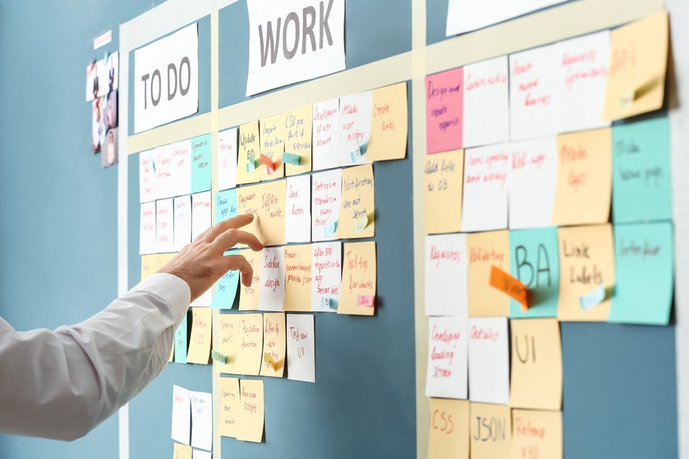
Benefits of Burndown Charts in Agile and Scrum
So now you know what a burndown chart is in scrum and sprint, what are its benefits? These lie in the simplicity, clarity, and real-time tracking it offers, aligning perfectly with what these methodologies stand for.
Enhanced Transparency
With a single glance at a burndown chart, stakeholders, whether they are product owners, managers, or team members, immediately gauge how the project is progressing.
Boosted Accountability
When progress (or lack thereof) is visualised daily, it encourages team members to take responsibility for their tasks. If the line isn't trending downward as it should, it becomes a collective concern that the team can address.
Since burndown charts are updated frequently, they provide immediate feedback, allowing team members to understand the implications of their work rate.
Informed Decision-Making
By analysing the trajectory of the actual work line, teams can anticipate potential roadblocks or accelerations, helping in better sprint planning and task prioritisation. If the chart indicates the team is consistently behind or ahead of schedule, it's a cue for the Scrum Master or the project manager to reconsider resource allocation, timelines, or even scope.
Alignment with Agile and Scrum Principles
Burndown charts inherently support the iterative nature of Agile and Scrum.
Firstly, they break down the project into manageable intervals (sprints), providing insights after each cycle. They also enable retrospectives, allowing teams to identify areas of improvement for subsequent sprints.
However, burndown charts are more than just visual tools. They're catalysts that foster a culture of openness, responsibility, and proactive decision-making, making them indispensable in Agile and Scrum environments.

Creating and Interpreting Burndown Charts
Creating a burndown chart might seem intimidating at first, but with a structured approach, it becomes a straightforward process. Beyond its creation, interpreting the chart correctly is crucial for making informed decisions. Let's delve into the steps involved in creating and deciphering a burndown chart.
Creating a Burndown Chart
1. Define the Scope
- Start by listing all tasks or user stories and estimating the effort required for each. This could be in hours, story points, or any other metric your team prefers.
2. Set the Timeframe
- Decide on the duration of your project or sprint. This will determine the length of the x-axis (time). Commonly, sprints in Scrum last 2-4 weeks.
3. Plotting the Axes
- X-Axis: Divide your total timeframe into consistent intervals, like days or weeks.
- Y-Axis: The maximum value will be the total effort estimated from all tasks or user stories combined. This represents the work to be done.
4. Draw the Ideal Burndown Line
- Begin at the top-left corner (total estimated effort) and draw a straight line to the bottom-right corner (zero effort remaining).
5. Track and Plot Actual Progress
- At the end of each interval, calculate the total remaining effort and plot this on the chart. Connect consecutive points to form the actual burndown line.

Interpreting the Chart - What Does the Burndown Chart Show?
1. Compare with the Ideal Line
- If the actual line is above the ideal line, you're behind schedule.
- If it's below, you're ahead of schedule.
2. Look for Patterns
- Steep drops might indicate productive days or underestimated tasks, while flat lines might indicate blockers or overestimated tasks.
3. React to Deviations
- Consistent deviations from the ideal line should prompt discussions. Are there resource challenges? Are requirements clear? Use these insights to adapt.
4. Predict Future Trends
- Use the current trajectory to anticipate if the team is likely to complete the tasks within the set timeframe. If not, adjustments (like re-prioritising tasks) might be necessary.
5. Feedback and Retrospectives
- At the end of a sprint, discuss what went well and what challenges emerged, using the chart as a visual aid.
In essence, a burndown chart is both a tracking tool and a stimulus for discussion. While its creation requires careful planning and daily updating, its true value lies in the conversations it sparks and the informed decisions it enables.

The Importance of Burndown Charts in Project Management
As the world of business grows increasingly complex, any tools that simplify and clarify information become invaluable. Burndown charts, with their straightforward design and valuable insights, fit the bill perfectly.
If you want to upskill and improve your project management, consider the wide range of courses offered by Pitman Training. We also provide several exceptional Project Management Courses, as well as a Project Management Diploma for those looking to fully upskill their management skills! Whether you prefer online or at one of our training centres around the country, you get industry-recognised certification at your own pace.
Take your future into your own hands and find out more today.